creating my Edinburgh Zine
As many of you probably know, I spent the last five of months on a semester abroad in the lovely city of Edinburgh in Scotland. I was lucky in that my studies allowed me to spend a lot of time exploring the town and drawing - I took my sketchbook everywhere and really tried to capture my time here. And now I’m back home - feeling a weird mix of sadness, nostalgia, but also content and grateful for the memories I’ve made and the person I’ve grown into. I don’t ever want to forget this time, and as an artist and very sentimental person (serious scrapbooker and tickets-and-receipts-collector right here), I collected all of my drawings, sketches and thoughts and turned some of them into a Zine - 143 Days in Edinburgh. My zine is now available in my shop.
In one of my courses at uni we were asked to come up with a self-directed project for the semester. I was very excited - I saw the opportunity to combine all the things I wanted to do anyways, and pack them up into one project for uni - a win-win situation, as they say. First of all, I wanted to really make the most of my time in Edinburgh. I wanted to immerse myself in the city, take long walks , visit museums, find small nooks and alleyways and hidden corners, go on trips and make this place feel like home. Secondly (different priority here), I wanted to open my online shop again. I have never really had time to focus on creating products for it in the past year, even though I really wanted to. Thirdly, I wanted to draw, create and paint - especially outside. Combine all those things and you get - you guessed it, my Edi Zine (Zine is pronounced like the last syllable of the word Magazine).
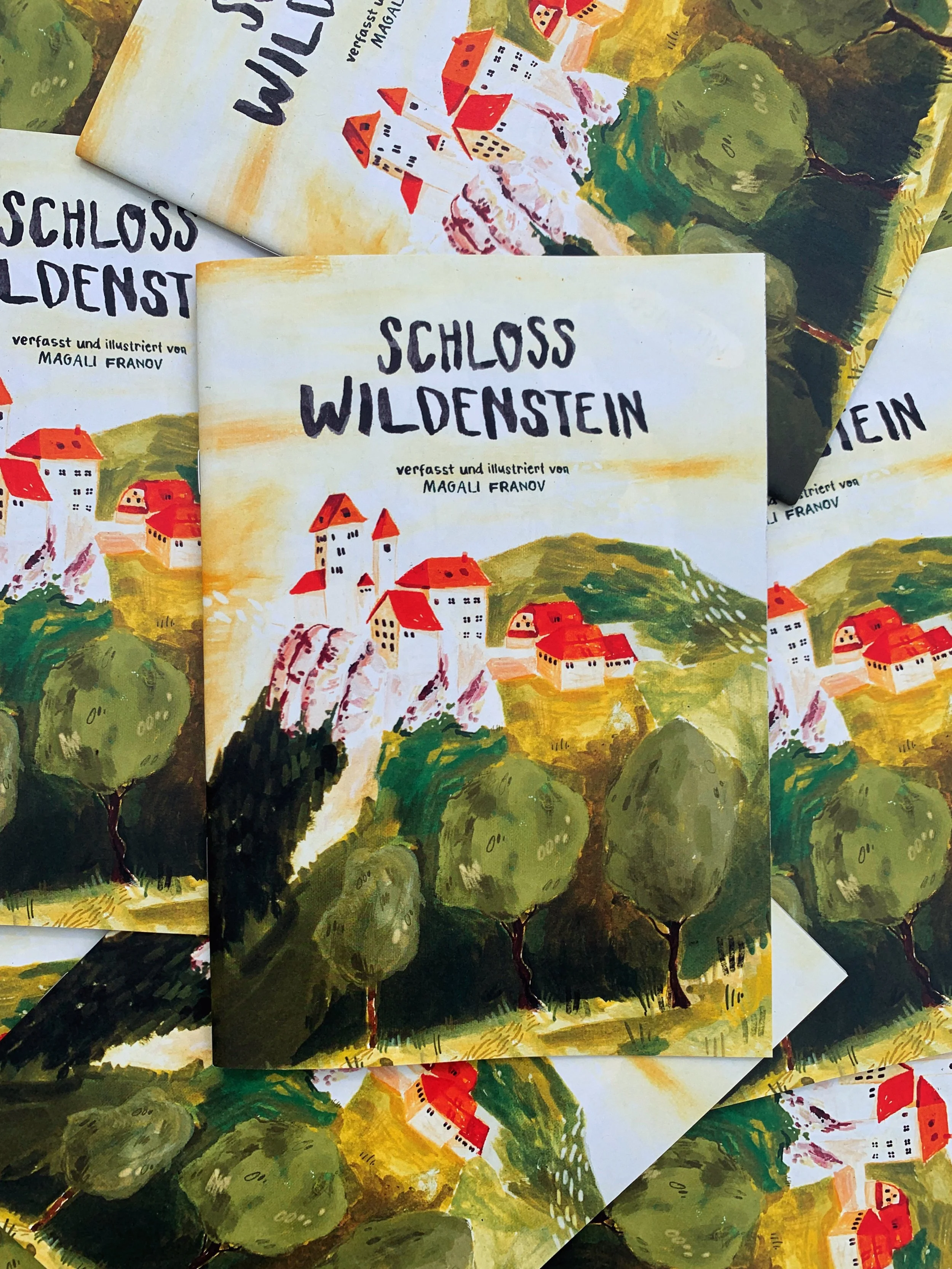
Schloss Wildenstein Zine
This is not my first time making a Zine, I’ve created two Zines before, one about my favorite place in Basel, St. Alban, another one about an old castle close to where I live. I really liked working on both of these projects - I discovered how much I love getting out of my room, away from my desk, and to go outside to draw - I felt like an explorer, on my own little adventure, writing notes in my journals, documenting my experiences.
If I’m being completely honest, I started this project without much of a plan. I mean, I had a lot of fun! I did exactly what I wanted to, I went on walks, visited museums, churchyards, parks, always bringing my sketchbook. I made many drawings during this time, some detailed illustrations, some very rough sketches. I got more comfortable drawing outside and got to know the city in the process.


After I had gathered a big collection of Edinburgh-related art, I started to think about how to put them together cohesively in a layout. This was my biggest struggle, I couldn‘t get to a place where I was satisfied with the look of it. There were many individual sketches, but no cohesiveness. Some sketches I liked, but many I did’t like for whatever reason - most of all, I felt like I was trying to be something I wasn’t. Some of the drawings didn’t feel like me, they felt like I tried to be someone else but didn’t live up to the expectation I set for myself. Maybe if you draw or write yourself, you know the feeling - I find it hard to explain. Like, before I started drawing, I had an image in my head of what I wanted my drawing to look like - maybe inspired by art I’ve seen before - and then in the end I was disappointed, because I couldn’t achieve the look I was going for. Oftentimes, my best drawings just happen - this time I felt like I was lacking spontaneity and was setting myself up for failure.
And putting the drawings together on actual pages, felt even more unsatisfying. I quickly gave up trying - this wasn’t working.
Time to go back to the drawing board! Which for me meant no drawing, but planning, coming up with a concept. To start off my research, I went to the Edinburgh Zine Library to look at already existing zines. I quickly learned that the conventional zine is not really for me - a zine is made cheaply and quickly, and I‘m a big fan of quality, long lasting products that you treasure. Most of the zines I found were made of cheap copy paper, stapled together, and it seemed like there wasn‘t a lot of love put into them - which is okay, just not what I wanted to make.
So I started looking at the zines that I own and love. What they had in common was that they are very illustration-heavy, good-quality prints on thick paper, A5 Format. I was inspired by Stories of Shrewsbury, a beautiful booklet by Morgan Grice about her hometown. I love how she used limited color palette which ties all the drawings together. So does Maisy Summer’s Night and Day Publication. But not all Zines I love have such clear concepts, Small Pleasures for Big Hearts by Charlotte Ager is a much more of a drawing collection, but still works beautifully as a book.
Notes from my research
If I’m being completely honest, I wouldn’t have done as much research into existing zines if it hadn’t been required for my course. In my opinion, sometimes looking at other people’s work can be hindering, as that only puts in your mind what’s already out there, and doesn’t force yourself to come up with your own, original, unique ideas. For this project though, it worked for me and gave me the push I needed.
early notes on figuring out a concept
Looking at all of these publications really helped me figure out what direction I wanted to go with for my own Zine. My zine should feel like a scrapbook or diary, it should be interesting to people who know Edinburgh, who want to visit Edinburgh, or people who don‘t care about Edinburgh at all. It should be filled with drawings, observations and personal anecdotes.
.I looked back at my work and thought: I can‘t layout digitally, but I am really good at making my sketchbook pages look balanced and interesting. So I started over: painting the zine pages in my sketchbook, letting the layout happen organically, not planning too much. In the end, I didn‘t really change a lot in post, I kept the spreads as they were in my sketchbook, with a few exceptions. This worked so much better for me.
I picked a day or place of the city as the theme for a double page; day trips, my favorite bookstores, good walks. This gave me a clearer concept and I could look at the pages sort of like an art-journal. I combined observational paintings with quick sketches, personal anecdotes with recommendations, illustrations with handwritten text.
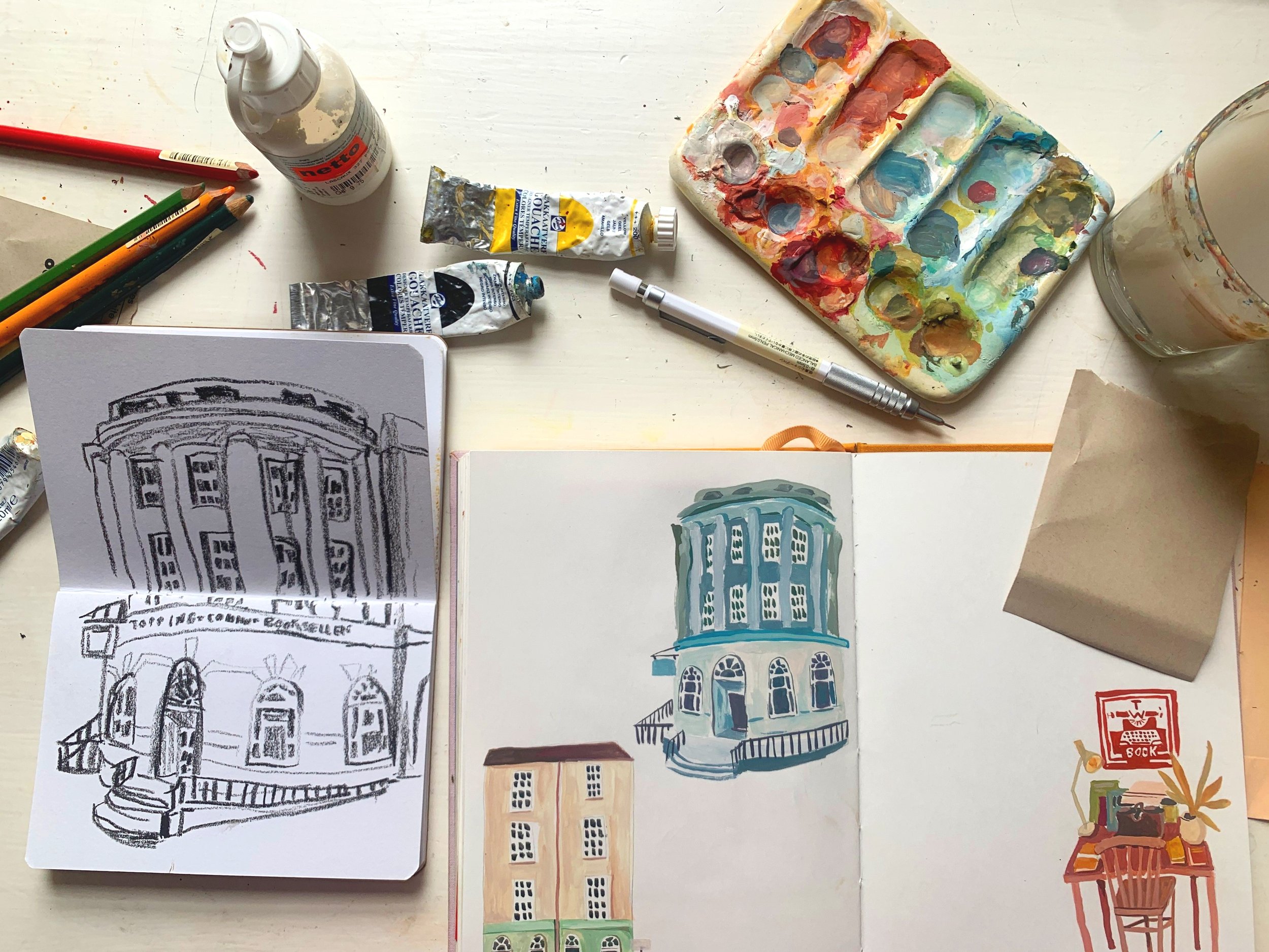
I finally felt like I was in a flow state - everything just worked. I referenced some of my previous sketches or went outside if I knew I wanted to draw e.g. a specific building, then came back home and painted, wrote, collaged.
from sketch on location…
…to sketchbook spread…
…to zine page!
This was my first time ever at an illustration fair selling my art in person! The Fruitmarket Artist Book Fair was happening in the middle of may, and the ECA illustration department had a table. This gave me a bit of a deadline, as I wanted to sell some of my zines there.
This was a really fun test run - I just got a couple of zines printed, and being able to look at them in person really showed me what I liked, and what I still wanted to change before getting a bigger number of copies printed for my online store. The biggest thing I noticed is that I wasn’t a fan of my cover design - there was too much white space and it just looked boring next to all the other colorful publications.
I documented the book fair in this video, if you’re interested to see more!
When I got home, I made some final changes, went to the printer to pick out the paper I wanted (soft, cream paper for inside and a thick craft paper for the cover), and got everything printed. I’m so proud of how this Zine turned out and I am so happy to have this book to treasure all the memories I’ve made.
You can now buy the zine in my shop.


