Creating a Middle Grade Book Cover
I found out about the Penguin Books Cover Design Award through my illustration teacher. When I saw they had a children’s book category I was so excited - it’s something I’ve been wanting to do for a long time and I could really see myself going into children’s book illustration after I’ve graduated. The only thing is - I’m not eligible for the competition as I haven’t been living in the UK for long enough. Ugh!! I decided to do it anyways - sticking to the brief and the deadline (edit: didn’t manage to stick to the deadline haha), as it is good practice and an important thing to put in my portfolio. You should always include dream projects in your portfolio, even if you make up your own briefs, just so that future clients can see what you can do.
This was my first time doing a project like this, but I thought I’d talk to you a bit more in depth about my process. This is just what worked for me, but I hope you can take something away from it or apply this to other projects.
But enough rambling from me, let’s get going!
First, I read the brief (carefully!). If you’re interested in more details, it’s still online here. But here’s the gist: Design a cover for the book A Murder Most Unladylike by Robin Stevens. It’s a mystery detective book for children age 9-11, set in a girl’s school in the 1930s and the first book in a series of 10. Penguin asks for a front & back cover design, as well as a logo for the A Murder Most Unladylike Mystery Series.
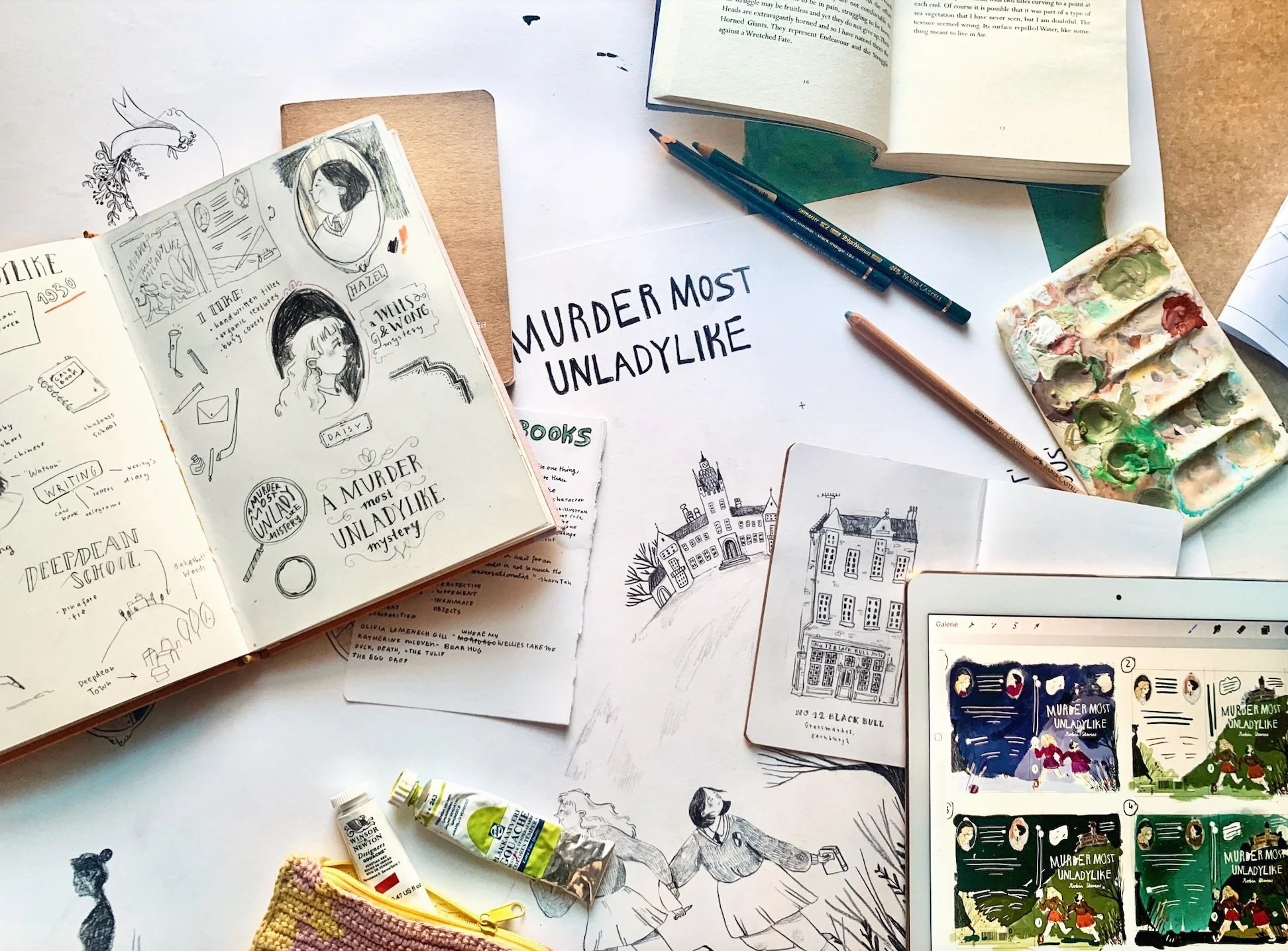
Then I started reading the book. I looked out for things I could use in the cover such as descriptions of the characters, traits, important items, and the overall mood of the story.
Another thing I did before starting to draw is to go to the bookstore. I went straight to the kid’s book section. As I don’t have much experience in this field I felt it was important to see what was already out there. I looked at all the different book covers and asked myself following questions:
what covers do stand out to me? why?
what do I like about them? is there something they all have in common?
I also tried to watch the kids looking at books to see what they would gravitate towards - felt a bit like a creep though!
Finding out what I like was the first step to getting towards what I want my cover to look like. It is also interesting to have a think about what you don’t like: for me that’d be very flat, digitally drawn book covers.
During my process I looked to other illustrators who have done loads of book covers: I love Julia Sarda’s compositions & characters, Briony May Smith’s organic pencil drawings, how busy Karl James Mountford’s illustrations are, the use of subtle colors & gouache by Felicita Sala.
I also thought back to when I was the age of 11, and what my favorite books looked like. I was drawn towards books with characters on the covers, such as Die Vier Zauberhaften Schwestern, Die Wilden Hühner or Liliane Susewind, as this allowed me to visualize the the characters much better and made me excited to dive into their stories.
The blank page can often feel intimidating, but you don’t have to let it have that power. I think it helps to just grab a cheap sheet of copy paper to get your first ideas down. I always start with just getting all my thoughts and ideas out. No idea is too bad to write down, actually sometimes it’s more important to doodle down all your bad ideas in order to make space in your head for the really good ones. At this stage, I don’t focus on anything looking pretty, it’s just about quantity and quick, rough sketches. There’s always the temptation to go with your first initial idea, but I try to resist that. More likely than not, if you sketch out 30 thumbnail ideas the first one won’t be the best, and if it is, you can be sure that you tried other things before coming back to it.
I often like to listen to podcasts or have a show on in the background whilst i work, but for this step I really have to eliminate all possible distractions to really think and emerge myself into the subject and let my ideas flow.
I decided on a thumbnail sketch where the characters were both on the front cover, the school in the background. Then I sketched out more detailed on procreate. I like working digitally for this stage, as it allows me to quickly change positions of various elements and I was able to already include the text in the design.
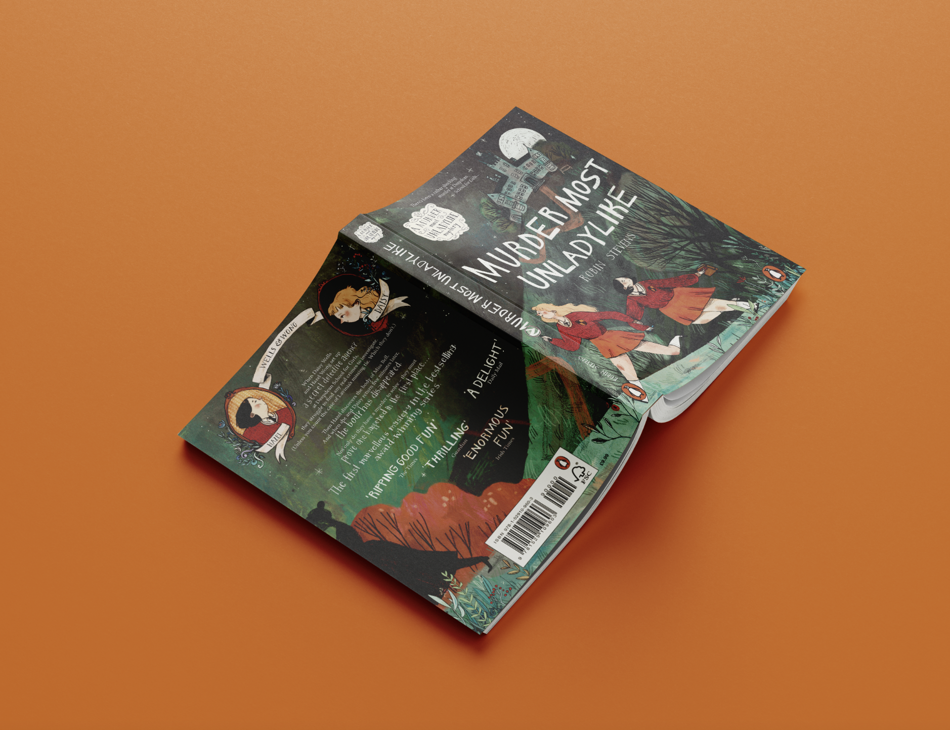
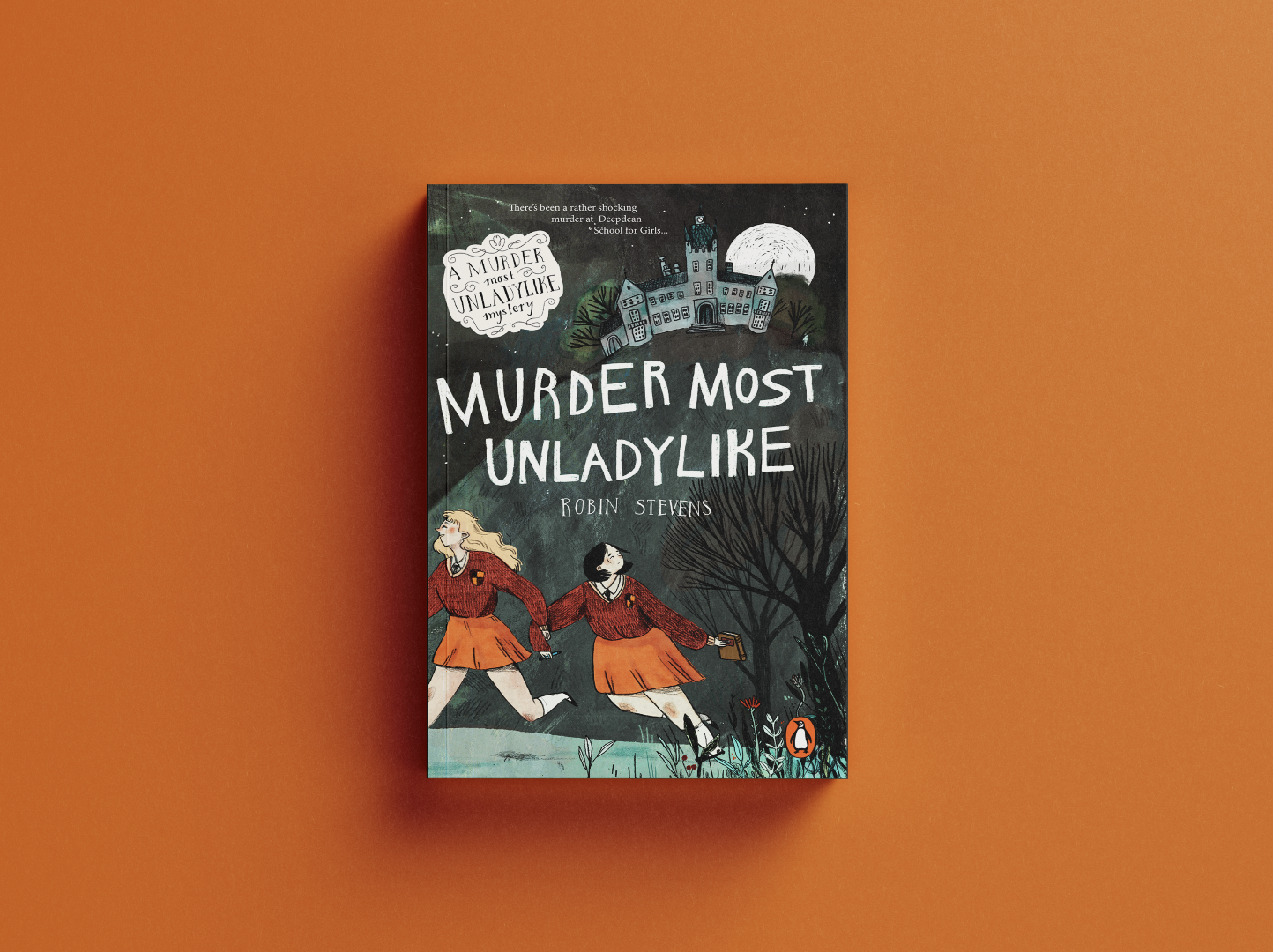
I like how this cover design includes all the important subjects in the book: mystery, friendship, detectives, boarding school. It is dynamic in the movement of the characters and composition, playing with foreground and background. The illustration connects back & front cover, you only get to see who the girls are following after you turn the book around.
Color can influence an image soo much! Therefore I find it very important to really think of the mood I want to convey in my design and how the colors I chose influence that. I made six quick thumbnail sketches with different color options, as I find it difficult to imagine this in my head. I think I like option 2 the most, but it looked too summer-y (the story is set in autumn) and too friendly, I needed something a bit more mysterious. Number 1 would achieve that, but I wasn’t a big fan of the colors personally. At this point I also asked my friends and family for feedback - sometimes other people see things that you don’t!
In the end I went for number 4, which satisfied my love for warm colors but had a more dark and mysterious feeling about it.
Looking back I am surprised to how much I stuck to that color scheme - normally I use the thumbnail more as a guide, but during the process of painting I end up changing and adding colors. This time I stuck to the color scheme almost exactly, I just ended up adding some more red elements and light blues.
Oh this is where the fun part starts! All the exhaustive thinking is behind me, now it’s all about drawing and painting. As you might remember, when I went to the bookstores and looked at book covers I found that I was very much drawn towards covers that organic textures and mark making on them. I love Briony May Smith’s work, and I think she uses black pencil for her drawings and then colors them in digitally. I decided to attempt a similar technique and started by transferring my digital sketch onto a big A3 sheet, and then doing all the line work and lettering with black pencil.
At first I thought about also doing the coloring completely traditional with gouache, but the thought of not really being able to make changes once that painting were done was very scary to me. So I used my gouache paints to paint a big, textured blob onto watercolor paper, then scanned it in to use in my digital drawing. I’d definitely recommend this technique, it allows you all the flexibility of digital art but with the organic gouache texture of traditional painting!
This final step of working digitally took me forever. Loads of back and forth, trying things out and then going back to how they originally were, looking at the cover as the full picture, but also as if it were in the bookshop; only the spine or only the front cover visible. I struggled a lot with getting as much interest and texture in the design as I wanted, and also with the color. But I think this step is hard to describe and easier to see, so here’s a process video for a part of the digital drawing process!
And now I’m finally done! I’m actually really stoked with how this came out, even though I had many moments of desperation during the process where I though I’d never get this to a stage where I’m satisfied with the design. But that happens with most bigger projects and most of the time you just have to push through those feelings.
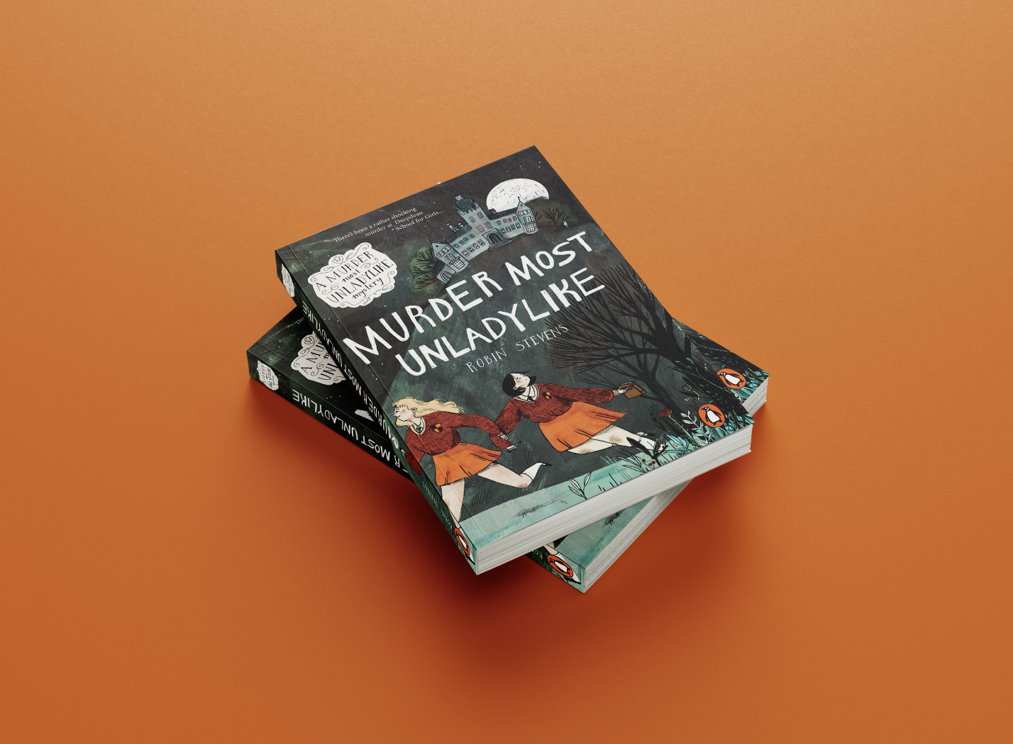
But without further ado, here is my final book cover design for A Murder Most Unladylike!
I hope you enjoyed reading this blog post and it that it was interesting to you! I’d love to hear about what you think and wether you like the book cover in the end? If you have read the book, do you find the cover fitting? Have you ever done a project similar to this, or would you like to?
Also let me know if there’s any other things you’d like me to write about in this blog, I’m thinking of maybe doing a post about 10 ways to fill your sketchbook.
I hope you are all doing okay.
lots of love, Magali xx


